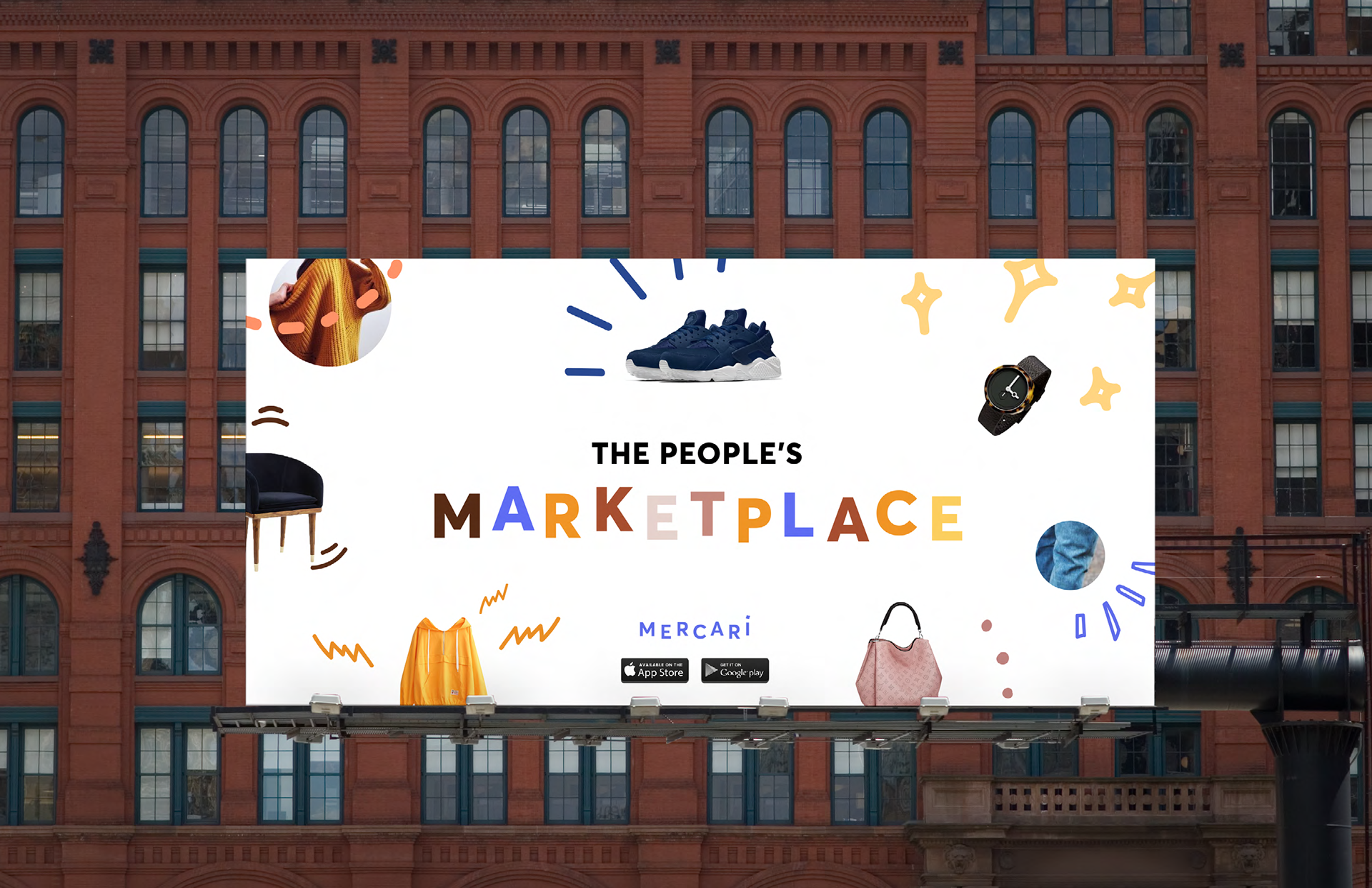
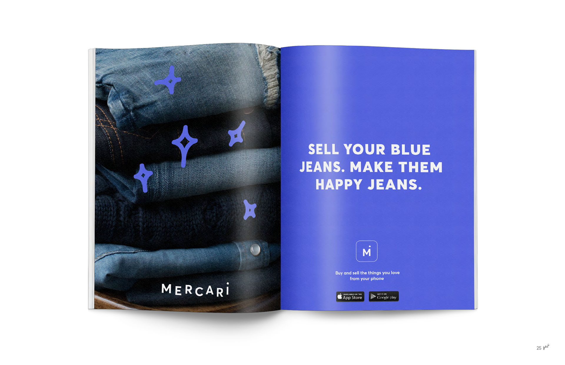
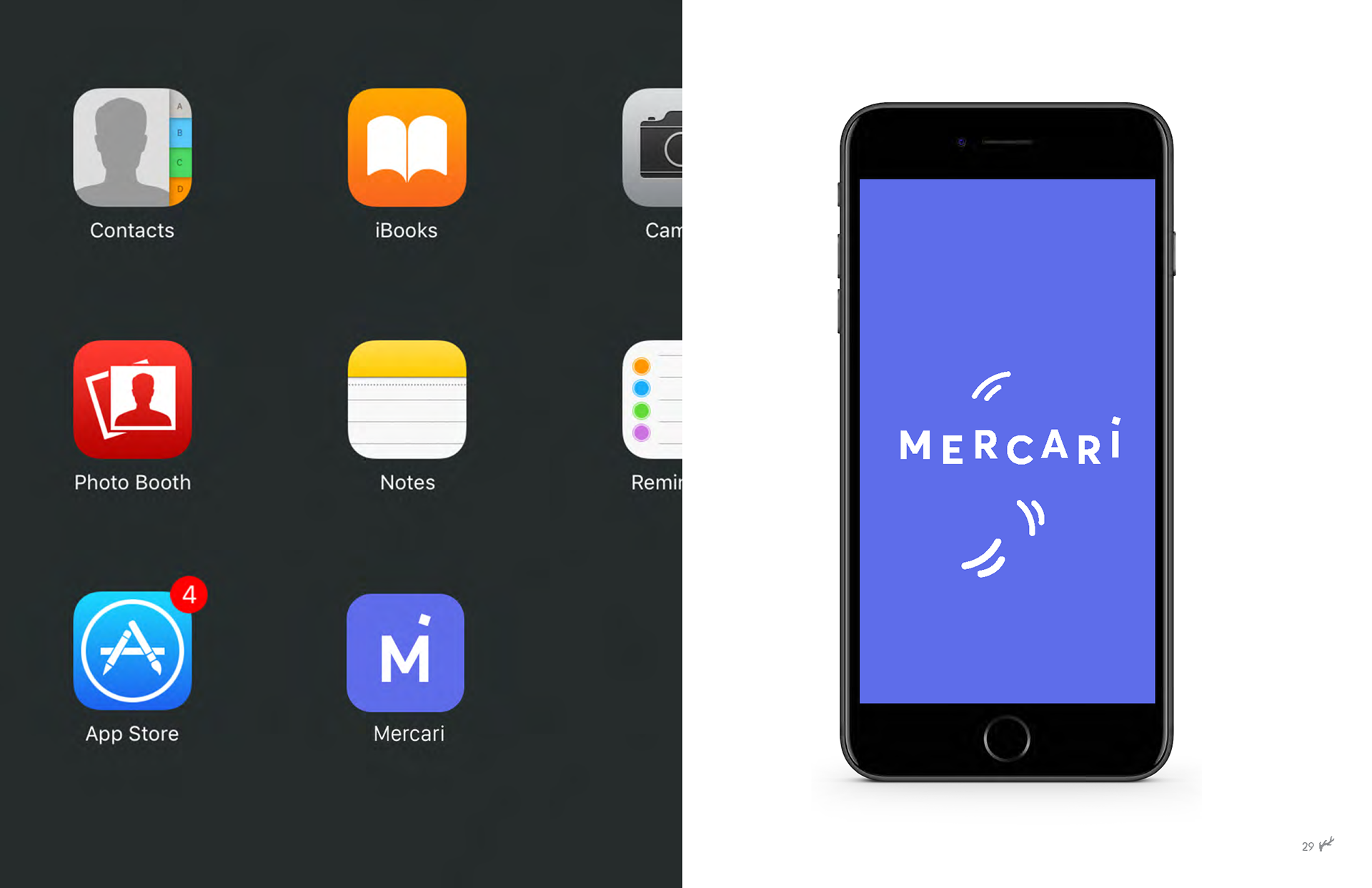
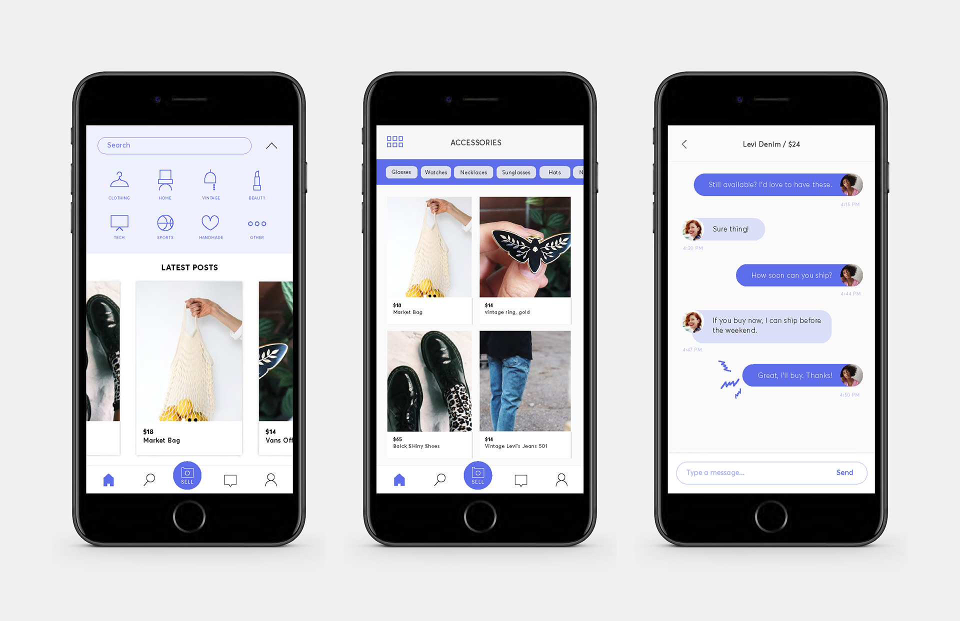
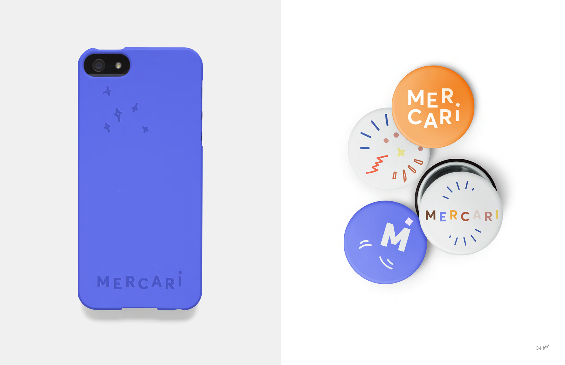
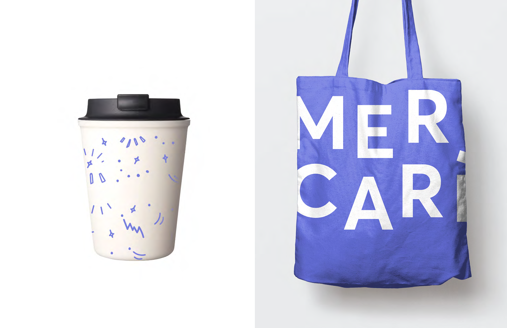
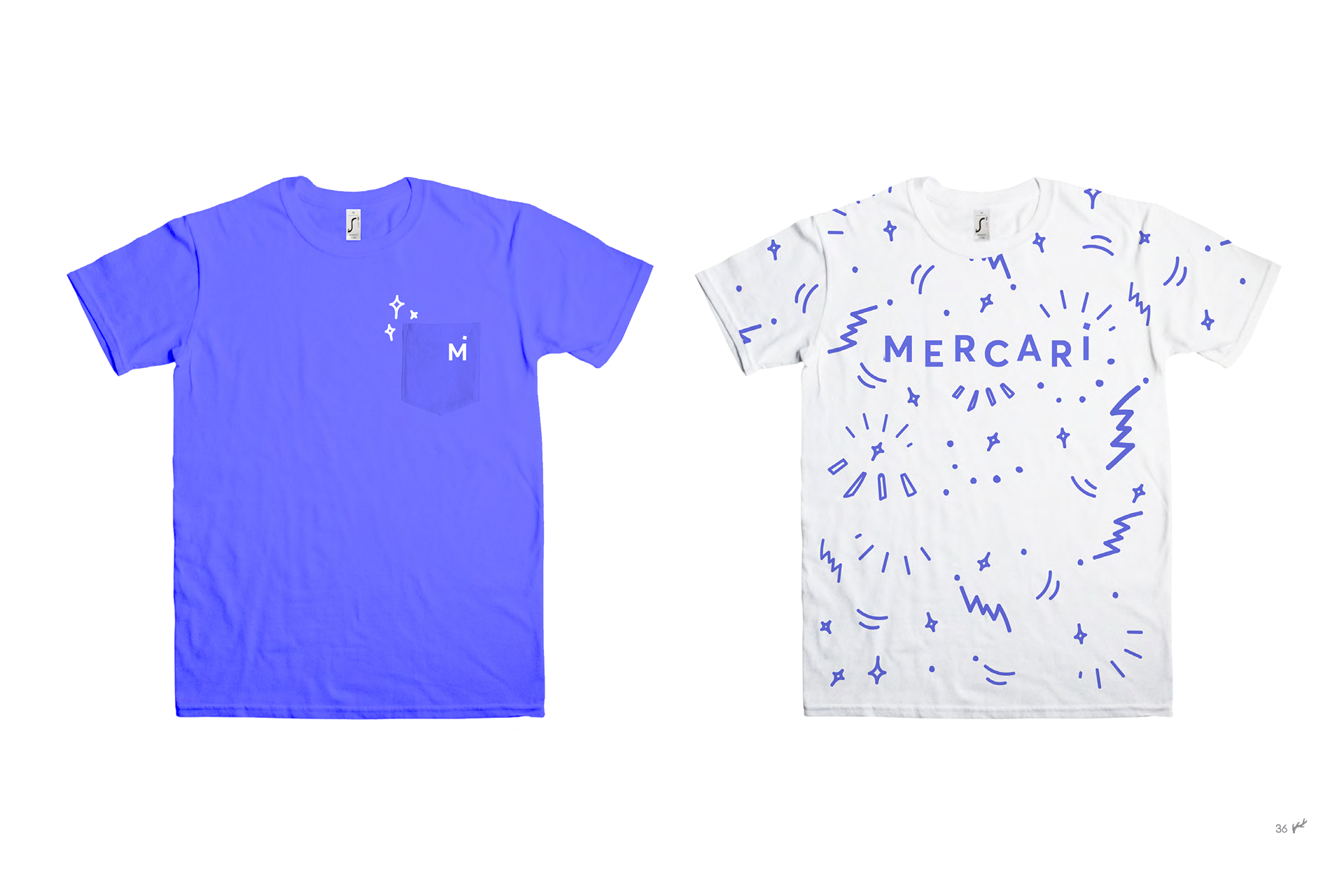
Mercari wanted to give their community of buyers and sellers a rebrand they could love as much as the products being exchanged on the platform. Our concept for Mercari’s rebrand came from the love the community has for letting something loved go, or giving something old a new home. The energy around these exchanges are reminiscent of a classic marketplace — people everywhere, shifting goods, always in constant motion. Interplay between the logo’s letterforms bring to life the energy found within a bustling marketplace. Color plays a major role in the way this brand demands brand recognition, but also in how it adapts contextually to showcase goods. A custom graphic system was created to help highlight the energy and life of second-hand objects in the buying and selling process. Since launch the logo has made its way to walls at HQ!
Agency — Red Antler